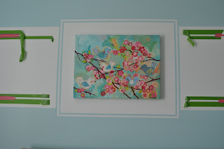
Once the pink lines (that wrapped around the room) got to the artwork (going above the crib) I hit an artistic road block. I didn't want the pink lines to just end (they did look predictable) and I wanted the artwork to be more of a statement. So, this is what I came up with.
I wanted a frame or boarder around the artwork. Not a physical matte/frame but, one with paint. So, I hung the artwork where I wanted it then started the taping process. I wanted the first matte to be white then a small aqua stripe.
I used an exacto knife and ruler to cut/score the tape to get perfect 90 degree angles.
The stripe was already white so I started with the blue. Then re-tape, re-tape, re-tape and more painting.
I had to paint....let it dry...then do the second coat. Then it was onto re-taping for the next part.
Don't you love all the tape....By-the-way.....USE frog tape....it's the best. It's worth the little bit of extra money so that you don't need to do a ton of touch-ups. If I would have had to do touch-ups everytime I took off a tape line...it would have drove me crazy! Way too much work!! Tip: if you run your finger along the edge while your finger is damp....or a damp cloth..it seals the edges(something in the frog tape activates with "wet" stuff or paint). So sealing it before you paint ensures a nice paint line.
I love the delicate lines around the artwork! Yeah.....now onto the pink lines!
I didn't want the pink lines to just run into the delicate blue/white lines so...I decided I needed an end cap on the pink lines. I started looking at stationary on-line because I knew they would have corner designs with lines.
I finally found one I liked...and used the design to make my own (free-handed by looking at the design on the computer screen while I sketched)
This was the original design but, it looked too modern and not girly enough.
I measured the distance between the pink lines and taped two peices of papers together to make a template.
I folded it in half and sketched one side then cut it out so both sides would be identical.
This shows you what I planned it to look like! The same width as the original pink lines.
I taped it up on the wall and used a pencil to trace my pattern.
I used my tape measure to make my hand-drawn line equal distance the whole way across. So, this line would be the same width as the rest of the pink lines that wrapped the room.
Then I started hand painting. It took a steady hand and patience but, it turned out beautiful. This line also took a second coat just like all the other colors.
The white stripe now needed a little altering to make my new design look finished. I looked like it just "ran" into the paint frame/matte. I used my same template to sketch out the same sillouette and then painted the excess in the light aqua blue wall color. The top and bottom of the design had to be free-handed to sillouette the pink lines. The original template was only as tall as the pink lines so I had to free-hand the top and bottom curve...using my measuring tape to keep the white band the same width.
You can see the difference of the two sides.....I just love the right side!!! I looks so finished!!
I did the same to the other side.
SO CUTE!!!!!
I love that I kept the TWO pink lines. It felt good to get it figured out!
Thanks for all the comments about keeping BOTH lines and that it looked great...even if it was predictable!! Hee Hee
So, it feels good to finally have the pink lines figured out!! Thank you for all the comments about keeping the lines....even if they were.....PREDICTABLE!! LOL
I just kept looking at them and looking at them. I did the frame around the artwork first then it finally dawned on me that I should just connect the top and bottom lines. My first idea was to just square off the end. I know....BORING...so I kept searching for something more decorative. I am so glad that I thought of stationary and trying to find something that would connect the two lines.
I like how the two lines each have a purpose and look SO cute!
Yeah!!! This just makes me smile every time I look at it...so, thank you for everyone who commented...you gave me the push I needed to get outside the box and challenge myself to think of something new!!


8 comments:
Oh Em Gee! Is that what you were struggling with? I would've never known...It looks AMAZING!!!! You, girl, rock!
My favorite thing you have ever done. It is darling. :)
That turned out so cute! I love it and it will look great behind the crib. Super fun!!
Oh, my goodness! That is absolutely beautiful! You just took painting a nursery to a whole new level--congratulations!
seriously!!You are so talented!
WOW! You are talented! And this room is done in my favorite color scheme. Love it! You have some mad skills and some serious patience doing those hand painted curvy lines. So fun! P.s.- I'm Dana Day's friend in TX and I'm now a follower of your talent!
I love the artwork. Is it custom? I would love to know where you found it. :)
Let me answer some questions..............
The artwork was bought off of a website titled posh tots and is titled Cherry Blossom Birdies Canvas Reproduction by Oopsy Daisy.
The paint color of the blue/green is Valspar(Lowe's paint) aqua whisper, the hot pink line is a porter paint color of cherry brandy. The white large stripe around the room is Valspar Swiss Coffee. Hope that helps!!
Post a Comment